2.8 KiB
| title |
|---|
| Icon |
As an important element in UI composition, Icon affects the overall style of UI interface to a certain extent. "Concise", "accurate" and "beautiful" are the design principles.
Icon style
Using linear combination of ancient copper coin style, extract the design principle of "round outside and square inside", the external structure is simple and comfortable, giving moderate tolerance at the same time, and the page rounded corner is more suitable; Internal pursuit of clarity and accuracy, such as the determination and accuracy of financial products.
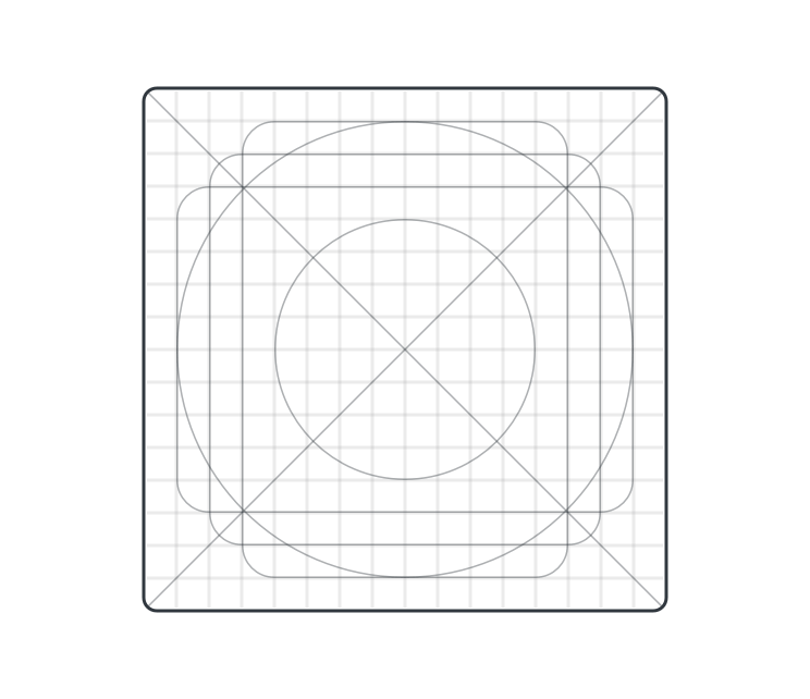
Grid specifications
As the underlying structure of diagram drawing, grid is the basis of all attribute design. Key factors such as the length and thickness of lines and the size and proportion of ICONS are determined on the basis of it. The typical icon size is 16px by 16px output.
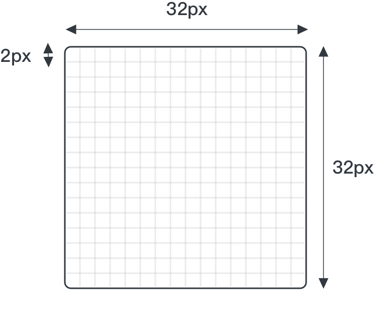
Canvas with auxiliary lines
As the actual operation area of icon design, the canvas plays the role of controlling the screen, limiting the size and adjusting the spacing. We normalize the circle, square and diagonal paths in the grid and generate a set of auxiliary lines system. The actual canvas should be positioned 28 by 28 pixels in the center of the grid, with 2 pixels of bleeding around it.
line
It is recommended to draw with 4px width strokes to allow more style possibilities in smaller grids, 4px at 32px.

Rounded corners
Keep the outer corners 4px rounded, the inner corners unrounded and the outer corners rounded and the inner corners square.

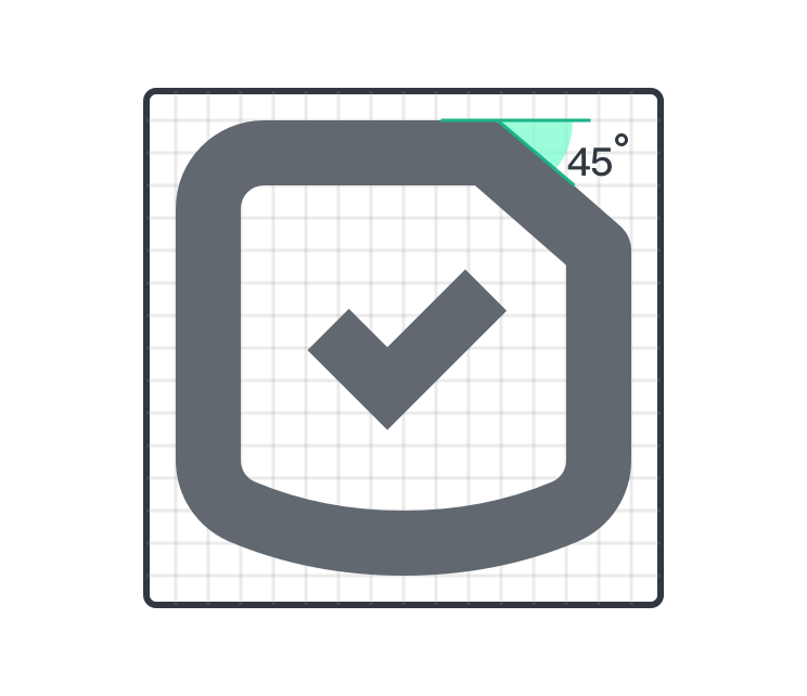
The Angle
Lines should preferably be tilted parallel to 45° auxiliary lines in the grid, or use multiples of 15°. In order to have high line definition in low resolution.